2023 Inkwell Press First Impressions and Review
It's time for my 2023 Inkwell Press First Impressions/Review!
Logistics & Customer Service
Thankfully Inkwell Press no longer sells out because I had to order my planner the day after launch day. While their new website is well designed and user friendly, on launch day it didn't have the Rewards Program showing and I wanted to use my points so I had to wait
I sent an email asking them about this issue via their chat on September 28th, but didn't hear back until today October 3rd. I don't expect small businesses to reply immediately, but more than 3 business days and during a launch isn't great customer service in my opinion. Since I didn't hear back quickly, I checked their site the day after launch (9/29/22) and the Rewards Program was back up so I was able to purchase.
Shipping & Packaging
The planner arrived quickly on October 1st. While it arrived in great condition, I continue to not be impressed with their packaging. For the past few years, orders have arrived in standard USPS Priority Mailers with cardboard around the inserts, but no branded packaging. Yes they still include the signature Inkling quote cards, but the overall packaging experience doesn't match the price and quality of the product.
Planner Layout
This year I only ordered the Classic (Vertical) layout. In year's past I've always ordered both the Classic and the Flex, but since I haven't been using the Flex and we don't need it for measurements I opted to just get the Classic. Though now, I'm kinda kicking myself for not getting the Flex. I've discovered some dimensions on the Classic layout are slightly different than last year, so I'm sure there's changes in the Flex too.
Color Palettes
I'm happy to report I love three out of the 4 color palettes for 2023. And even though I'm NOT a pink fan and this pink palette is pink, it's not horrible.
Palette one which is used for January, May, September is blue and called Mediterranean. It's a nice soft, smoky blue palette.
Palette two which is used for February, June, and October is olive green and called Fiesole. I love olive greens, so this totally up my alley.
Palette three which is used for March, July and November is pink and called Gelato. And again this is pink, like bubblegum pink. Not my jam, but could be worse.
Palette four which is used for April, August and December is yellow and we don't have a name from IWP for that one yet. I've totally been into yellow the past few years, so I was happy to see this color.
Design Changes
While the layouts are the same as usual, there are a few subtle dimension changes that I noticed. Honestly they are random and pretty useless in my opinion, so I'm not sure why there were even implemented.
The fonts for the words on the side and holidays in the month and weekly view are so tiny! Like probably a font size 6. Yes that makes the space look clean, but its very hard to read especially when the text is colored.
The line spacing and column widths are slightly narrower. I don't care about the shorter line spacing, but I don't like seeing the column width reduced.
The Daily Boxes are bigger/taller and the header on the weekly pages in the Classic is slightly shorter and there is an extra line in the "escalate" section.
Since I didn't buy the Flex, I'm not sure how these changes are reflected in that layout.
Not much else from IWP
I was excited that they might have had more up their sleeves to release on launch day, since that's what it sounded like on their emails and Instagram posts. But we only saw one new cover, which was nice, but not my style and some gold stickers. Very anti-climatic.
KOPS 2023 Inkwell Press Sticker Collection
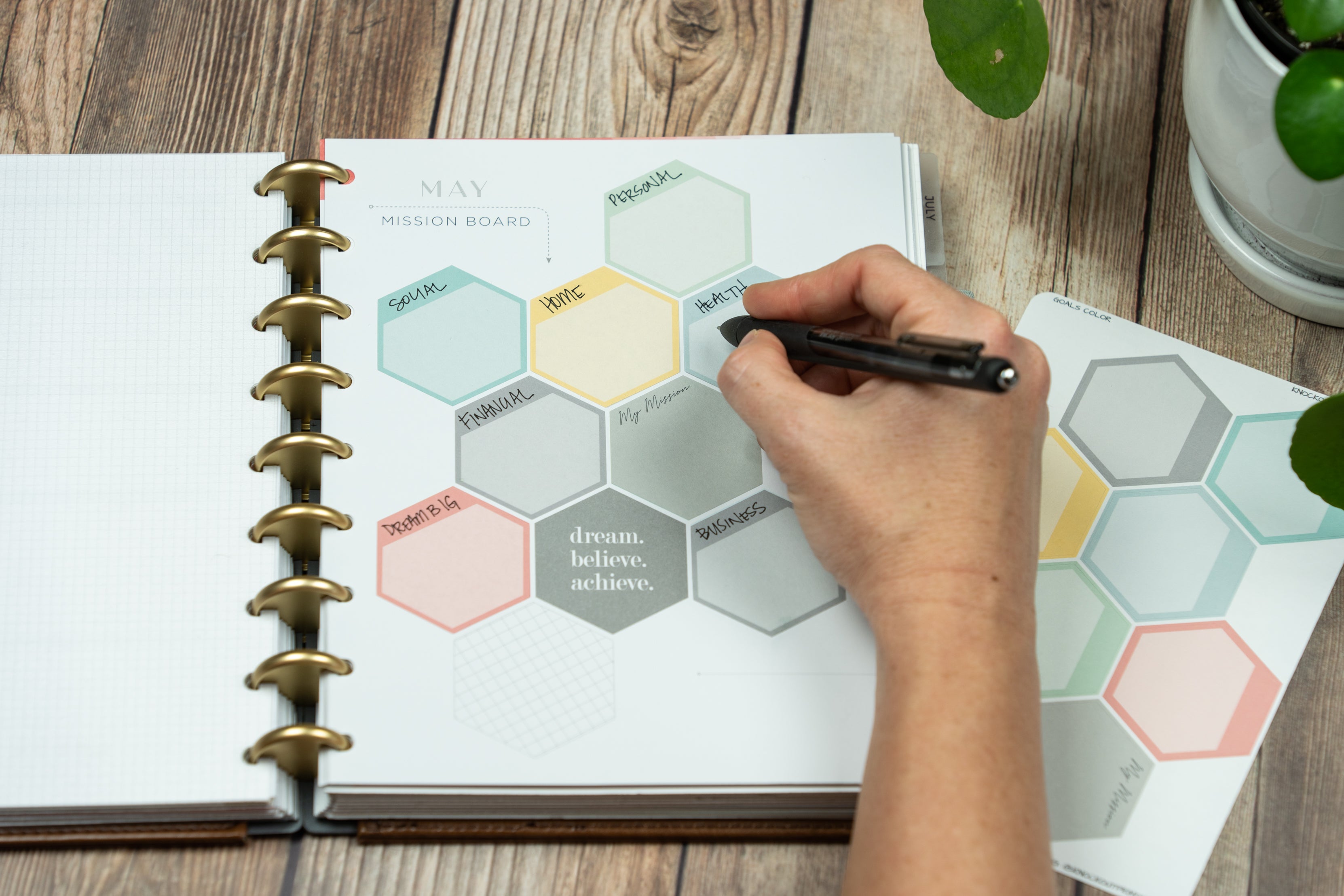
We've decided to go with single color sheets this year verses the gradient we did last year. So for each palette you will get a version of the main color that coordinates with the weekly pages. Honestly while the gradient of the main color looked great on a sticker sheet, I think having one color makes more sense.
I don't know about you, but when I've been using stickers this year in my Inkwell Press I've been annoyed when I ran out of a color from a gradient on the sheet and had to use a different shade for the rest of my spread.
If you watched my video, you heard me say we weren't going to do the Grey and the Teal palettes for 2023. While after filming we looked at our sales report and saw that Grey and Teal actually did better than we thought, so those will be back.
Launch experience
Unfortunately, the Inkwell Press Planner launch experience has gotten pretty blah over the years. There isn't much marketing of sneak peeks leading up the launch, not excitement on launch day and then she shows the color palettes revealing one per day after launch.
While I'm not one to get super into hype or over the top marketing, I do miss when there was some build up to the new planners.
Closing Thoughts
I still LOVE the Inkwell Press Planner paper and the Classic layout really works well for me. So I'm happy I bought the 2023 Inkwell Press Classic. I think the colors for 2023 are some of the best we've seen in years. And while there are a few weird tiny design changes, I don't think they are anything that would deter most people from purchasing.
None of my wishlist changes came true - the words are still on the Classic layout as is the dark header, but at least I'm into the colors this year.
Will you be buying an IWP?
So what are your thoughts on the 2023 Inkwell Press Planner? Will you be purchasing one? Share your thoughts in the comments below.
More Planner Reviews Coming Soon
I also purchased the 2023 English Version of the Hobonichi Cousin for the first time, so that review is coming soon. And stay tuned for my review of the 2023 Makselife planners!
Affiliate Link
Here's my affiliate link if you are interested in purchasing Inkwell Press Planners and accessories.
If you purchase using our links we do get a small commission and truly appreciate your support.


POST COMMENTS
Desperately need your dividers….preferably with monthly names. I’m still using the last ones that IWP made…how old are those?! Open to suggestions if you don’t make them, but I prefer to give you the business!
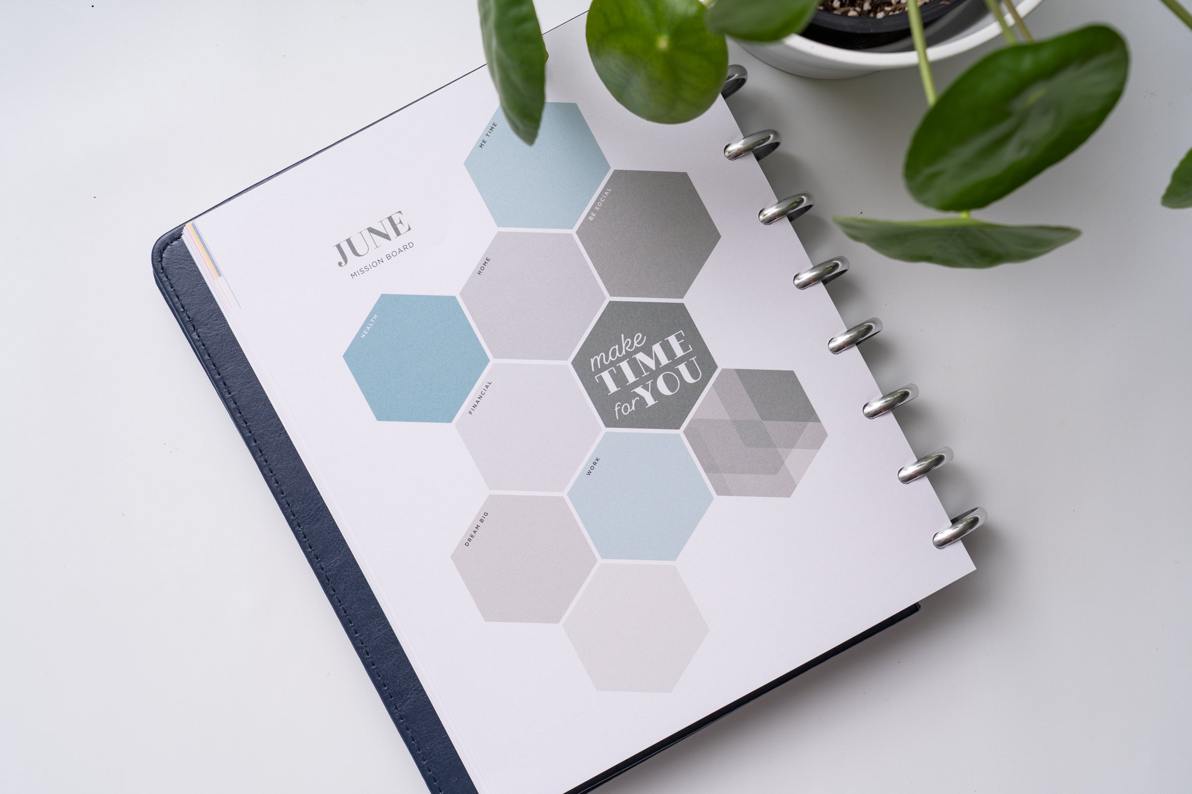
The mission board and notes pages are now in their original placement prior to the disc bound planner system. I prefer this placements. I like the softer color colors, especially for the three bottom boxes, as it appears more neutral. However, the softer colors combined with the small text does make it harder to read.
What are your thoughts on the change in the order of the monthly inserts? The Month name is on the back of the right page, not the left page. This means I get the monthly spread, turn the page and get the Month name and mission board. Personally, I much preferred it the other way.
I want to love IWP. I bought into the disc system when they first released and I love the paper but honestly I’m so bored with the line up year after year. I forget about then until I get an email. I wish they would expand on their covers, to me they are very blue based and I have the pink chipboard and some vegan leather covers but I would love if they did something vibrant.
Hi Jess! Haven’t ordered yet — I’m a Flex fan. I’ve been flipflopping whether to get the Goal inserts again. They seem exactly the same and I think they need a big refresh. On the other hand, I do use them and love the paper. I’ve liked the Makselife big picture planning tools much more than IWP lately. Maybe I will get my IWP inserts using your link! :) Personally I really like the color palette as well. Yellow is my 2nd fave color, behind orange. No question I will order inserts. I was also totally meh on the new cover. The vegan leather has held up well so am sticking with that.
I totally agree that for what has to be a major money-maker, there really isn’t much going on here. I get the sense that not only did Tanya sell the planner business, which is totally cool, she isn’t the guiding force behind the material and the new company is another venture cap or PE owned shoestring operation that has no idea what customer service is.